Mobile Layout Recommendations
In many verticals, customers are far more likely to open their email on their phone or tablet, where real estate is limited and layouts must be carefully considered.
Note: Every retail site is different and what works best for one is not guaranteed to translate into gains for another. As such, treat this guidance as general best practices—a foundation for optimization from which site-specific tuning should occur
Email on Mobile
Like fitting our recommendations best practices into mobile apps, understanding the constrains of email on mobile requires us to accept certain truths:
-
Scarcity of space. Mobile devices have constrained viewports which limit the real estate available for placing content. As such, mobile experiences must deliver streamlined content and designs to avoid overwhelming customers with clutter.
-
Different consumption. When an email with recommendations is opened on a mobile device, even with a click on a recommendation, users will not always go directly to purchasing the recommended item, particularly if that item is a higher-ticket item. Mobile purchases tend to be for cheaper, lower consideration products, so keep this in mind when building your email campaigns.
To simplify, mobile users are utilitarian. Think of them as distracted, with less time to spend browsing, and often with a specific goal in mind—and that’s to get in, find the information they’re looking for, and get out.
Mobile-Specific Best Practices
While most of what follows is written specifically for Recommendations on a mobile device, similar guidelines apply to email viewed on a mobile device. It is important therefore that your email template is designed to be responsive to screen size.
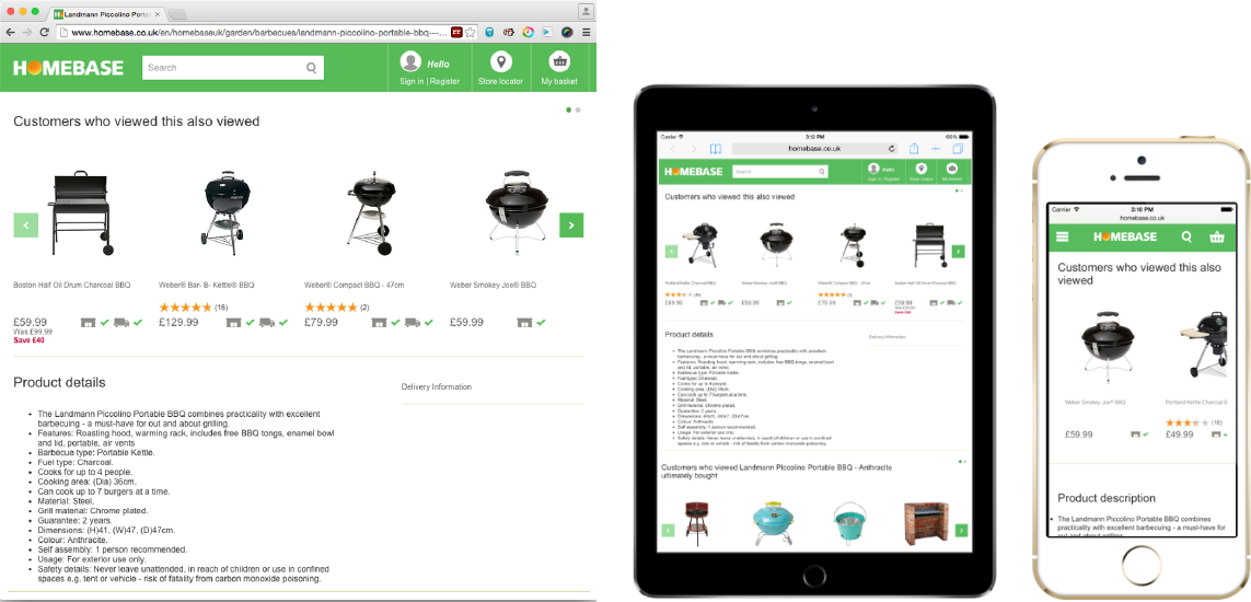
Below, on the left, is a website with recommendations. In the middle is the same page viewed on a tablet. On the right, the same page viewed on a mobile phone.

Below are the main mobile best practice callouts:
-
With layouts, less is more. Depending on the page design, use horizontal and/or vertical layouts that showcase 2-3 products at a time (don’t try to cram more products into display). Both orientations should allow the customer to view more products via a simple interaction. If a horizontal layout, use a carousel housing no more than 10 products and allow users to scroll through the swipe gesture. If a vertical placement, include a call-to-action to view more products.
-
Ensure to use hi-res product images that are optimized for mobile devices. Also, limit product names to no more than 2 lines; where applicable (for example, Apparel), consider removing product names in their entirety if they don’t provide valuable information to the customer.
-
Streamline the strategy messaging. There are obvious page width constraints with mobile devices. When necessary, use alternate strategy messages to avoid multiple lines of wrapping text. Statements such as “People who viewed this also viewed” can be condensed to “People also viewed” without losing efficacy.
-
Invest in quality cross-sells. Cross-selling has an elevated priority on mobile and in email in general. Remember, customers visit mobile sites with specific intent; so, rather than prioritizing the display of alternative products—something we commonly do on desktop—we acknowledge the customer’s interest in the item(s) that brought them to the site and present relevant options to complete their purchase.
-
It’s important to cultivate mature cross-sell recommendations that represent truly incremental buys rather than a replacement for the current item. Also, given what we know about the mobile customer’s propensity to purchase low-ticket items or more impulse buys, it’s preferred that we cross-sell reasonably-priced products that don’t require much consideration. For example, on mobile, it’s easier to sell the TV customer a $20 HDMI cable than a $500 stand. Consider Advanced Merchandising, offline POS data, and/or price boosts to better-curate cross-sells.